
Hipcamp is a two-sided marketplace for camping on private land. Think: Airbnb for camping!
Overview
Mismatched camper expectations became the #1 theme in negative reviews due to the lack of site-specific details that Hipcamp enabled Hosts to provide. To address this consumer problem, the Host team had to overhaul how Hosts configured their campsites upstream.
My Role
Lead (and only!) UX Designer & Researcher
Outcomes
Increased booking conversion by 48%
Increased GMV by 2x
Increased Camper retention by 30% YoY
Successfully launched across 175K+ sites
Highlights & Key Flows
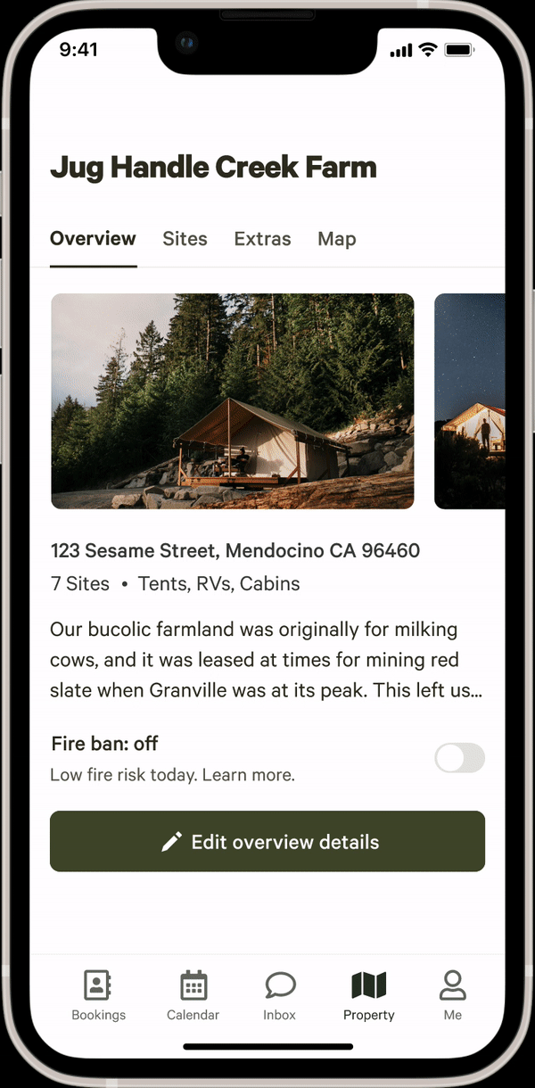
Property tab
Goal
Enable Hosts to easily navigate between the details of their property, sites, extras, and map
Reinforce how listings are presented to campers
Outcome
Over 175K sites were updated, resulting in a 30% increase in Camper retention
Successfully created and integrated new design system components (header, tabs, buttons, carousel)
“Honestly, as good as Airbnb’s editor is, I think this is even better!” - Josh, Hipcamp Host in California
“I love that I can see all my sites in one place. The thumbnails help me see what campers see.” - John, Host in WA
Site Editor
Goal
Allow Hosts to easily edit their sites (for the first time ever in-app!)
Motivate hosts to improve their online listings to increase camper engagement
Outcome
After MVP launch, 68% of Hosts made updates where missing information was indicated
Hosts that added site-specific information saw a 21% bump in booking conversion
“I’m constantly making changes. This makes it a lot easier for me to find what I’m looking for” - Elizabeth, Hipcamp Host in Milwaukee
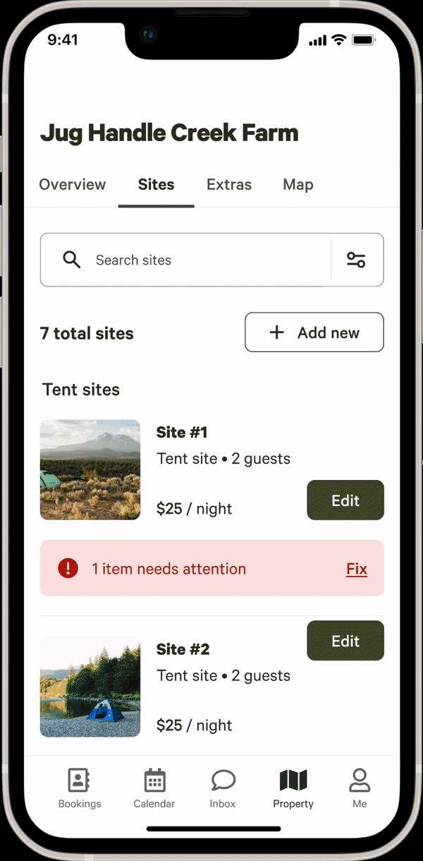
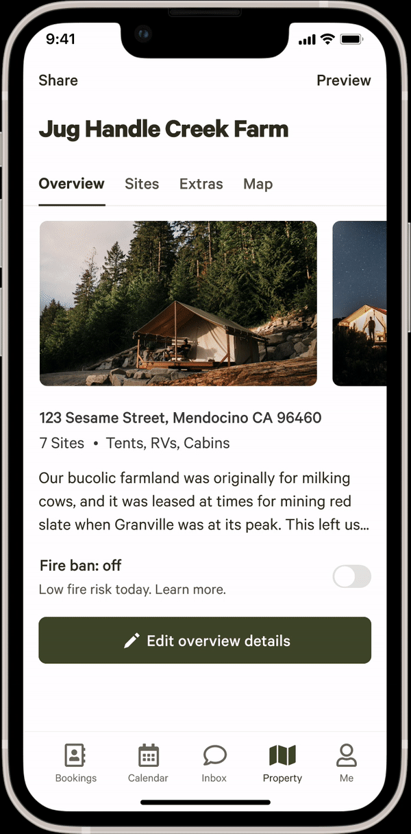
Photo uploader
Goal
Improve listing quality by collecting more site photos per Host
Upload, edit, and re-arrange photos with ease
Outcome
Hosts that added site-specific photos saw a 21% bump in booking conversion
Since MVP launch, 20K Hosts have uploaded more than 700K photos on the mobile app
“I love that I can upload photos directly from my phone” - Daniel, Hipcamp Host in Colorado
The Process Explained
The Problem
Not all sites on a campground are created equal. For example, let’s imagine a beautiful campground in Big Sur, California. One site might have a view of the ocean with a picnic table, and another might be in the woods, closer to a bathroom. These details matter to campers, but Hipcamp’s product experience wasn’t optimized for distinguishing between these features. This made it difficult for campers to choose the right site for them on a Host’s property.
How did we get here?
The flow on the right highlights some of the user problems and questions that campers would face as they selected a campsite.
Would all three sites have the same essentials and amenities?
How would these sites differ from one another?
How close together are they? Is there privacy?
Because Hipcamp’s product experience didn’t address these questions, campers would often feel confused and disappointed upon arriving on their trip. They’d drive hours to a campsite that was completely different from what they had expected, and these mismatched expectations ultimately became the #1 theme in negative app store reviews.
How do we solve this?
After diving in deeper, it became clear that this was ultimately a data problem. Campers desired specific details about sites, but Hipcamp didn’t allow Hosts to provide those details. So, the solution was clear: we needed to update the Host platform UX to collect and present the site-specific information that campers expected to see. The hypothesis was that this improved experience for Hosts and Campers alike would impact our product goals of increasing camper retention and booking conversion.
The Process
In order to begin to address this problem, I split out the process into 5 testing phases:

Validation Phase
Overhauling the entire Host and Camper product experiences was going to be a major initiative, so it was important to understand if it would be worth the effort before diving in. We measured this by showing a wireframe-based prototype to a group of Hosts and Campers in order to validate our hypothesis and ensure the idea had legs. We asked participants to compare the older property-centric layout against a new site-centric approach and asked which one they preferred.

Overwhelmingly, Hosts and Campers preferred the new site-centric version. Campers liked that they could view details about each site alongside a map to help get a lay of the land, while Hosts liked that they’d be able to offer specific details about each of their sites. This gave us the go-ahead to explore further.
Navigating the Experience
In order to understand how Hosts would best navigate this new experience, it was important to dig into how they understood their land. I approached this with a card-sorting exercise to better understand how Hosts thought about property-level information versus site-level information. These findings impacted the overall information architecture of the experience.
The next step was to test this with a lo-fi prototype to understand how to best visually distinguish between property and sites. We tested two layouts:
Version A: Keep the content on a single page, with a summary of property details at the top, and a list of sites below.
Version B: Utilize tabs to separate between property, sites, and other categories like extras and maps.
The flow below showcases how a Host might edit site-level information like pricing between the two versions:
It turned out that both of these formats tested well with Hosts. However, because the tab format was preferred by Hosts with a lot of sites and generally scaled better for future optimizations, we opted for Version B.
High-Fidelity Prototype
At this stage, it was time to build out the prototype further to address edge cases and ensure that Hosts could easily navigate their wide breadth of data. After all, we were working with over 200 flows! At this stage, I asked Hosts a series of questions/tasks and watched as they navigated each layer of the prototype. We also tested discoverability of missing information. Below is an example of an in-depth flow, adding a missing description and updating the site’s capacity:
The hi-fi prototype testing very well with Hosts, who raved about the new experience and were excited to use it themselves! They were easily able to distinguish between property vs. site information, and navigated the experience seamlessly (aside for some minor UI issues). After addressing those fixes and building out each flow diligently, it was time to release the final designs. You can view some of the highlights at the top of the page.
Impact to Date
While the full experience is set to launch later this year, the MVP has already made an impressive impact on the business thus far:
68% of Hosts fixed missing information within 30 days
Those Hosts have seen a 21% increase in booking conversion
Over 700K photos have been uploaded since the MVP launch
We’ve seen a 30% YoY increase in camper retention thus far